Case Study — Advertising & Print

WORK THAT
MOVES PEOPLE

National campaigns, award-winning editorial, and retail point-of-sale

Twenty-plus years of campaign work across higher education, energy, consumer packaged goods, and the public sector — from concept-driven national print ads to award-winning editorial design and point-of-sale. Built to persuade. Built to last.

6+Clients
5GD USA Awards
20+Years
AgencyPartnerships
Rasmussen University · American Petroleum Institute · Baltimore City Public Schools · Schmidt Baking Co. · GW Engineering · Print Campaign · Editorial Design · Point-of-Sale · GD USA Award Winner · Rasmussen University · American Petroleum Institute · Baltimore City Public Schools · Schmidt Baking Co. · GW Engineering · Print Campaign · Editorial Design · Point-of-Sale · GD USA Award Winner ·

Rasmussen University — Higher Ed · National Print Campaign

Rasmussen University

Higher Ed · Agency · Print Campaign
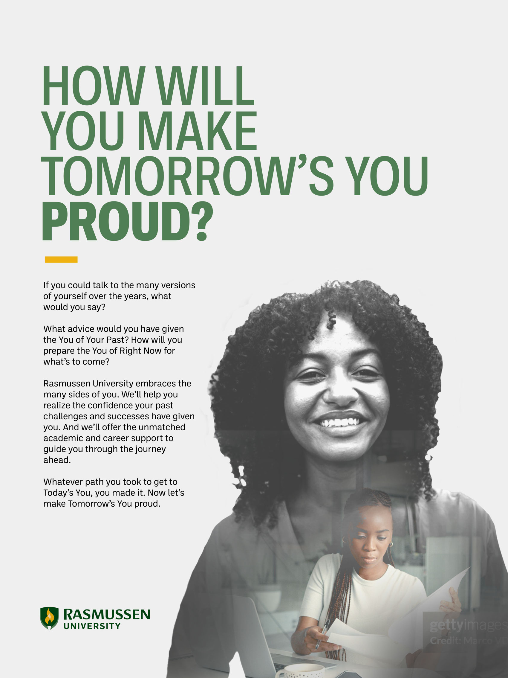
Rasmussen University — Tomorrow's You
Full-Page Print Ad

"Tomorrow's You"

A concept-driven campaign speaking directly to the non-traditional student — working adults, career changers, and those returning to education after life got in the way. The headline challenges the reader to envision a future self looking back. The double-exposure portrait blends aspiration with identity, reinforcing Rasmussen's message that where you've been informs where you'll go.

Delivered through an agency partnership, the work required balancing strong emotional resonance with a clean, flexible typographic system that could travel across placements.

Rasmussen University — How Far You've Come
Full-Page Print Ad

"How Far You've Come"

A companion execution in the same campaign. The art direction uses a torn-paper reveal — a woman literally peeling back a layer to expose a larger, more vibrant version of herself. Bold yellow and a confident, upward-facing portrait do the emotional heavy lifting. The copy reframes past detours as proof of future potential.

Two ads. One voice. A brand platform built on earned confidence rather than empty aspiration.

American Petroleum Institute — B2B · Editorial · Print

American Petroleum Institute

B2B · Editorial Design · In-House
API Insight Magazine Spring 2007
Magazine Art Direction

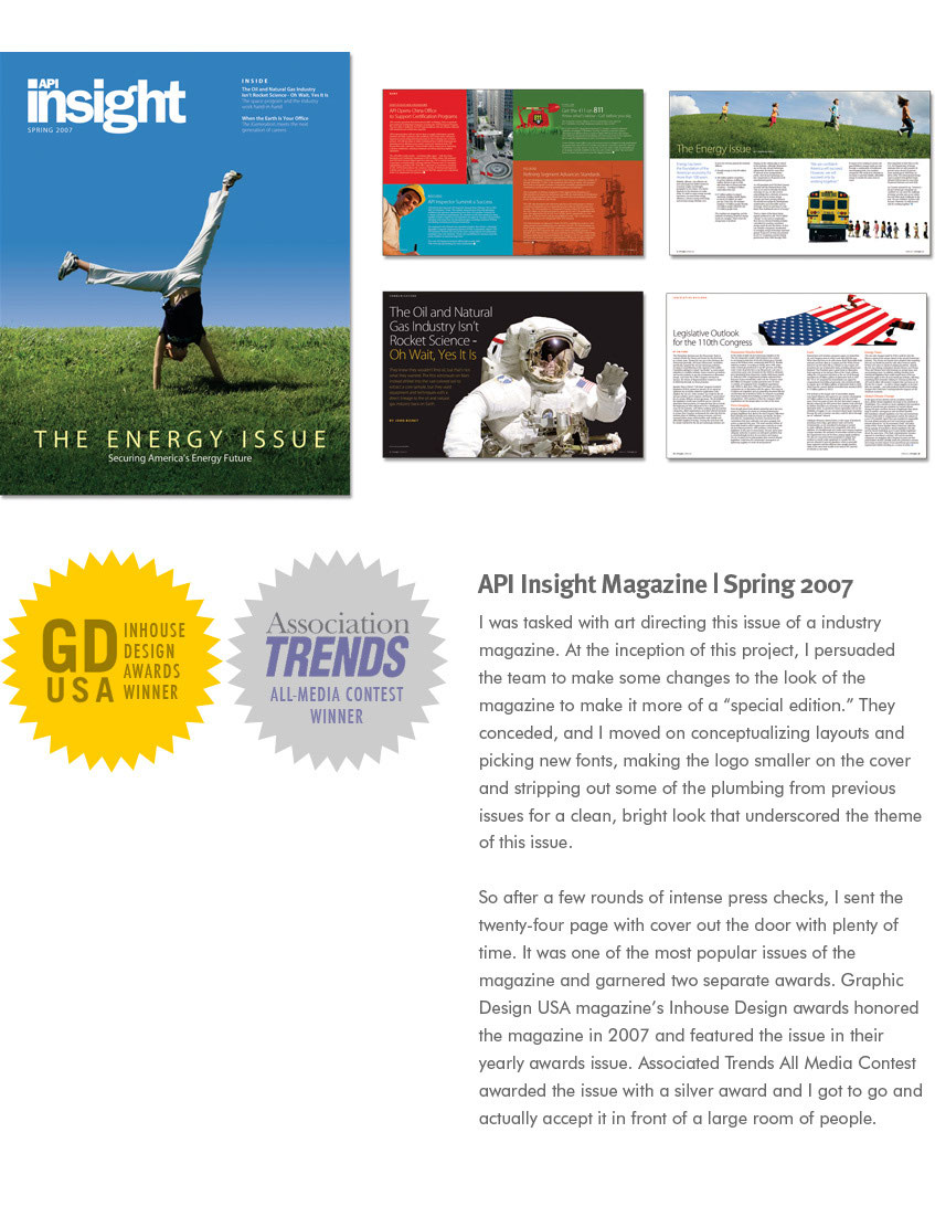
API Insight — Spring 2007 / "The Energy Issue"

Tasked with art directing API's industry magazine, I pushed leadership to treat this as a special edition — reducing standard masthead weight on the cover, introducing new type, and stripping away legacy template clutter in favor of a clean, bright editorial voice that matched the issue's theme. The result was one of the most-read issues in the publication's history.

GD USA Inhouse Design Award 2007 Association Trends All-Media Silver
API Insight Magazine Fall 2007
Magazine Art Direction

API Insight — Fall 2007 / "Safety & Security"

Following the Spring issue's success, I returned to art direct the Fall edition — now with a new magazine logo, a much tighter deadline, and simultaneous department management. I adapted the updated brand direction and added my own enhancements to push the look further. Delivered on time. Won again.

GD USA Inhouse Design Award 2008
API Energy Efficiency Brochure
Brochure Design

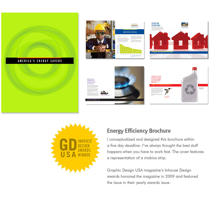
America's Energy Savers

Conceived and designed in five days. A tight deadline forced fast, decisive choices — the cover concept, a Möbius strip rendered in electric chartreuse, became the defining image. The interior balances data visualization with strong photography in a format that feels like a magazine rather than a compliance document.

GD USA Inhouse Design Award 2009
API Protecting Livestock Brochure
Brochure Design

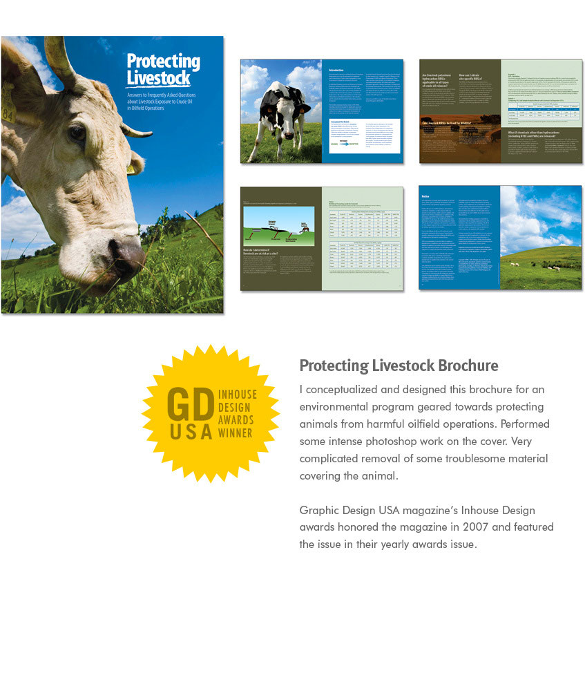
Protecting Livestock

An environmental program brochure for oilfield safety — about as unsexy a brief as they come. The cover solution: an extreme close-up cow portrait with intensive retouching to remove distracting elements from the animal's face, turning a functional document into something genuinely arresting on a shelf. The interior uses a warm earth palette with crisp data tables and technical diagrams.

GD USA Inhouse Design Award 2007

Additional API Work

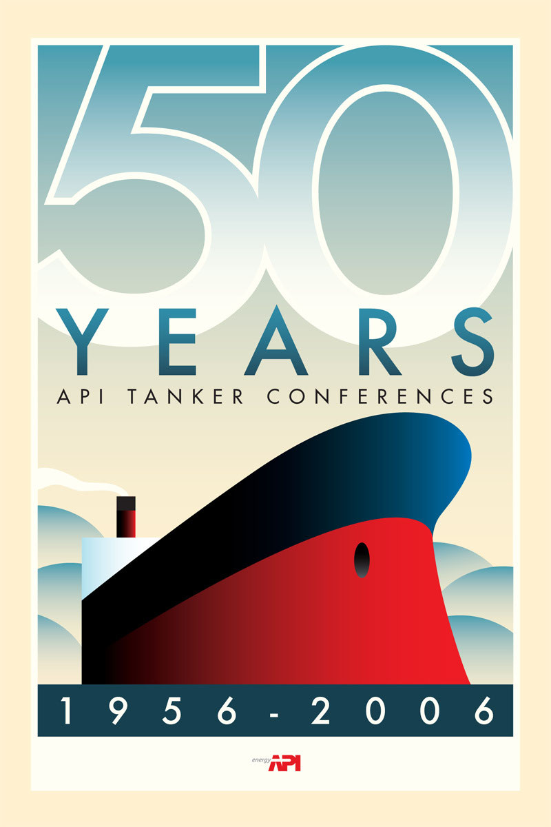
API 50 Years Commemorative Poster
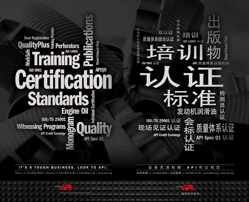
API Certification Bilingual Ad
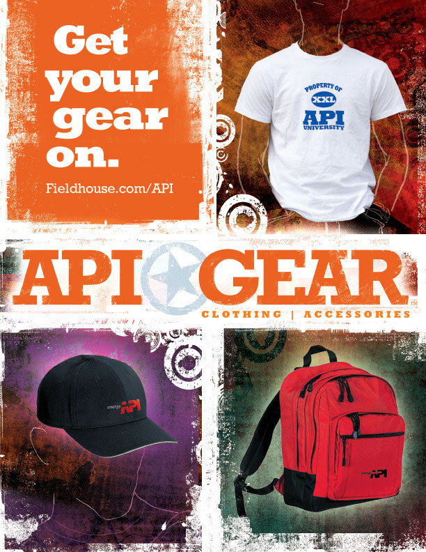
API Gear Ad
Commemorative Poster

50 Years — API Tanker Conferences

Art deco-inspired poster marking half a century of API's Tanker Conference program. Illustrated entirely in vector with period-authentic styling.

Bilingual Print Ad

Certification & Standards — English/Mandarin

A diptych word-cloud execution communicating API's certification depth to international markets. Adapted fully into Mandarin for the Chinese energy sector.

Merchandise Ad

API Gear — "Get Your Gear On"

A branded merch campaign for the API University gear line. Grunge-textured and bold — a different register from API's institutional voice, aimed at a younger trade audience.

Baltimore City Public Schools — Public Sector · Recruitment · Brand

Baltimore City Public Schools

Public Sector · Agency · Recruitment
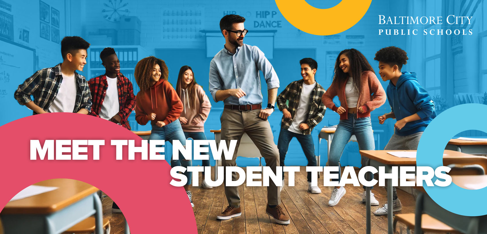
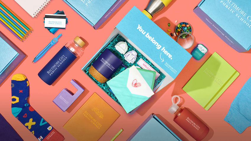
Baltimore City Public Schools — Meet the New Student Teachers
Baltimore City Public Schools — Branded Product Suite
Recruitment Campaign · Brand Merchandise

Meet the New Student Teachers

A teacher recruitment campaign delivered through agency work. The hero banner uses compositing to place a diverse, energetic cast of students and educators in an authentic classroom setting, with bold geometric shapes in the district's brand palette creating immediate visual energy.

The branded product flat-lay — district-logoed merchandise from water bottles to notebooks — extends the "You Belong Here" message into physical touchpoints, serving both recruitment and new-hire onboarding communications.

Schmidt Baking Co. — CPG · Retail · Point-of-Sale

Schmidt Baking Co.

CPG · Agency · Retail POS
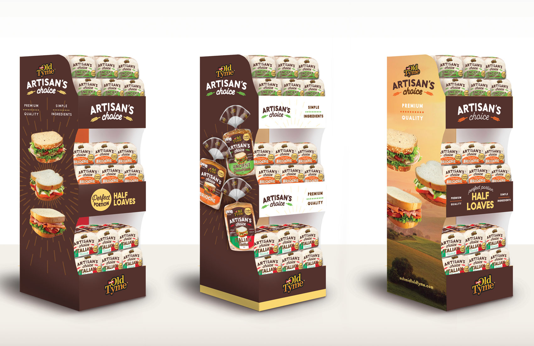
Schmidt Baking Old Tyme — Artisan's Choice Floor Display
Retail Point-of-Sale · Floor Display System

Old Tyme — Artisan's Choice

A floor display system for Schmidt Baking Company's Old Tyme brand, presented across three colorway executions — dark chocolate brown, warm white, and harvest gold. The displays merchandise multiple SKUs (Brioche, Ancient Grain, Italian) while maintaining a premium artisan shelf presence in competitive grocery environments.

The three-panel system communicates "Premium Quality, Simple Ingredients" at retail scale — brand messaging readable at a distance, with appetite-appeal photography anchoring the consumer at eye level.

GW Engineering — Higher Ed · Development Communications

GW Engineering

Higher Ed · Agency · Print Collateral
GW Engineering — Invest In Innovation. Invest In Her.
Donor One-Sheet · Print Collateral

"Invest in Innovation. Invest in Her."

A major gifts fundraising one-sheet for GW's School of Engineering and Applied Science Center for Women in Engineering. The piece needed to function simultaneously as a compelling case statement and a sophisticated donor ask — presented in a premium printed format for face-to-face development conversations.

Bold, activist-style typography pairs with data visualization (donut charts showing enrollment gaps) and an ASEE Bronze Diversity Recognition credential — giving donors both an emotional hook and institutional credibility. The reverse carries a detailed philanthropic menu with tiered naming opportunities from $250K to $2.5M+.

Delivered as a four-panel, two-sided piece with three photography variants — each featuring a different student portrait — allowing the development team to tailor their approach to different prospective donors.

Dave Medina
← Back to All Work